Custom Charts
A couple of days ago I migrated Visualizer to edge Rails which is version 7 that is still being built and tested. While doing that I also migrated the frontend parts to use import maps.
I didn’t announce this anywhere because I was fully expecting to encounter some issues and would have to revert, and also because most of you don’t know or care how the cookie crumbles (how the coffee grinds? 🤔).
But it is working spectacularly well and frontend is now much faster to load, faster to develop, much faster to release, and there’s even less of a burden on my server.
Anyway, what I’m announcing today is much bigger. I just shipped another big feature that was widely requested: custom chart configurations.
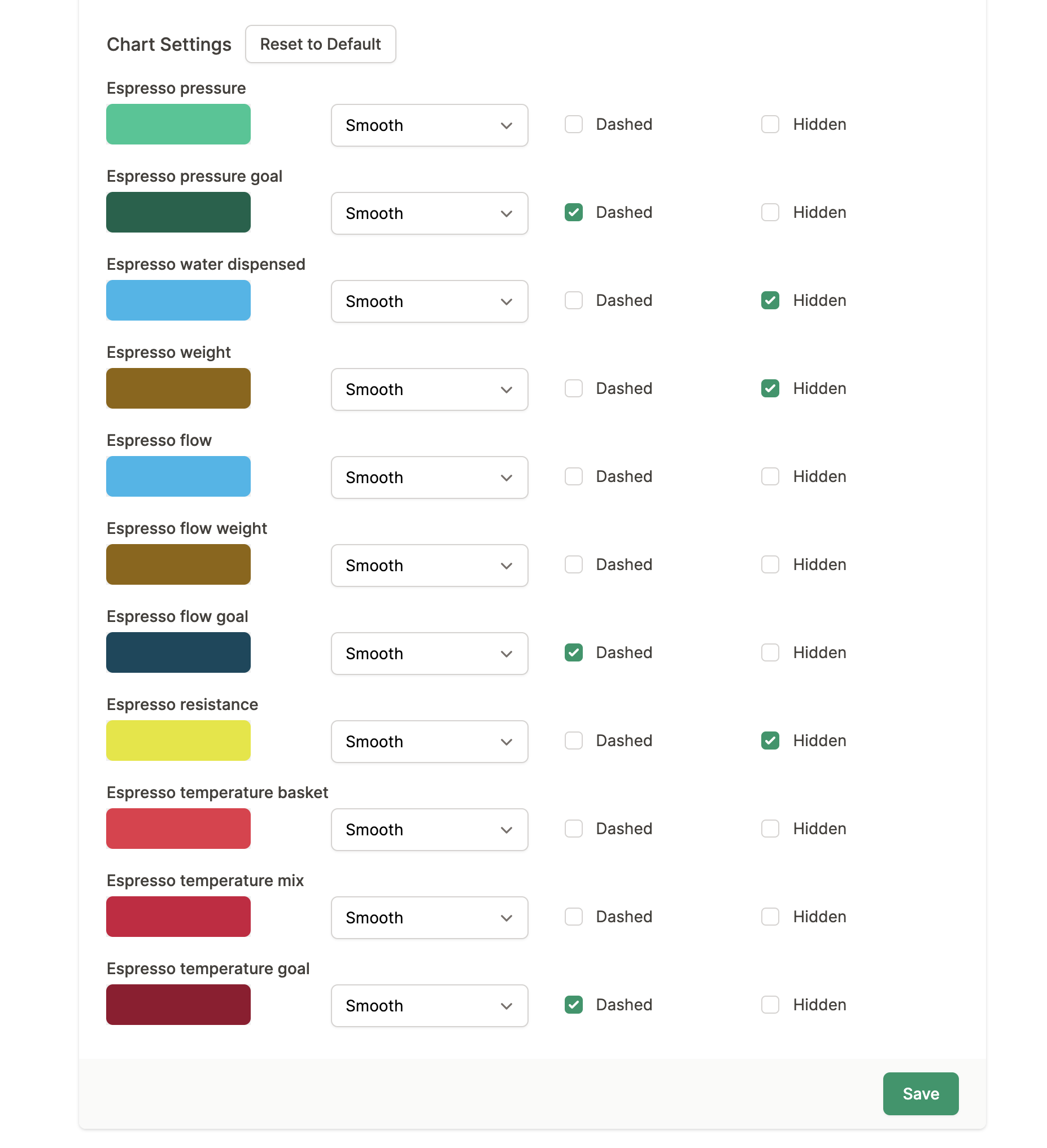
You can now customize the charts in your profile to your own liking. Hide lines that you don’t want to see, show some that you want to see, change the color, change if it’s dashed or not, and change if the line is smooth or exact. Play with this as much as you like and have a truly customized insight.
And, fear not, if you screw up, there’s the “Reset to Default” button which will reset things to how you see them on the screenshot above which was the “Classic” skin before.
With that skin no longer affects the chart so I simplified and renamed it to simply Light/Dark.
Hope you enjoy this feature, and go crazy with your chart configurations 🥳